As many of you have already heard (either on our podcast or via the pic below that we posted on Instagram), we’ve renovated our kitchen in what turned out to be the biggest, most comprehensive renovation project that we’ve ever undertaken. It was long, it was fun, and – much like planning a wedding – we’re thrilled with the outcome, but very grateful to have it behind us. (Unlike a wedding, there was not nearly enough cake involved).
Like our living room and dining room makeovers (which we detailed in our second book), we decided to bring this renovation fully to completion before sharing it. We learned from redoing those rooms that letting go of the whole blogging-in-real-time thing keeps us focused on creating the best outcome our family, instead of being distracted by what might make the best content and stressing about a big public countdown to reveal day. It’s nice to have time to really live with a room and gradually tweak little things (and even a few big things) as opposed to racing for the camera before the dust even has a chance to settle.
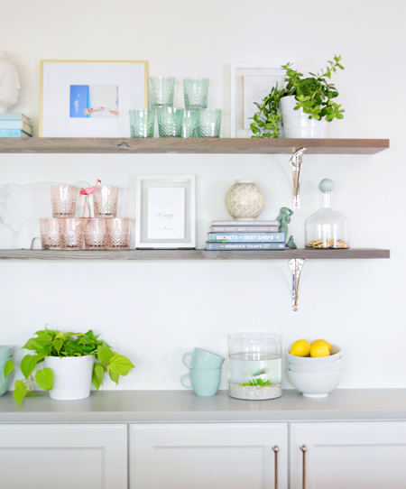
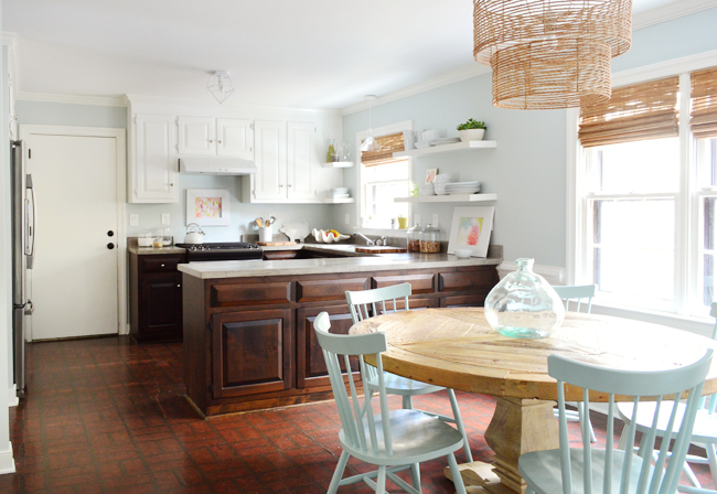
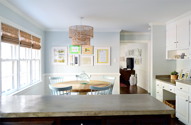
Now that we’ve reached a point where we’ve lived with it for a while and it feels “finished” (said with big bold quotes because no room is ever really done – especially these shelves, which Sherry seems to rearrange every couple of weeks), there are probably a million ways we could share the whole ordeal. We have a ridiculous amount of photos and topics to cover (so many lessons learned!), but we’re thinking we can probably spill it all in a handful of posts – which isn’t too shabby compared to our other kitchen renos that took 4+ months to share across 40+ posts each. And we figured we’d toss in some finished shots as we go. Like so:
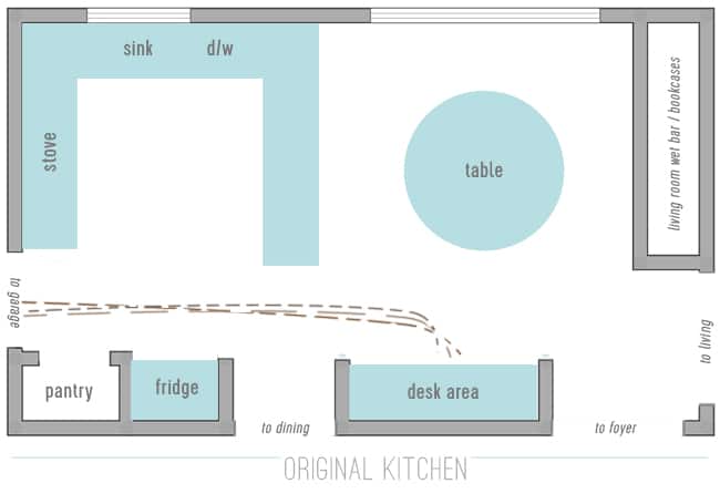
But let’s back up. Today we want to talk about planning and how we decided to totally overhaul the layout. The new floor plan is the unsung hero of the whole undertaking and in many ways it was the toughest part (it was something we mulled over pretty much from day 1 of living here). As a reminder, here’s what it looked like then:
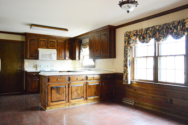
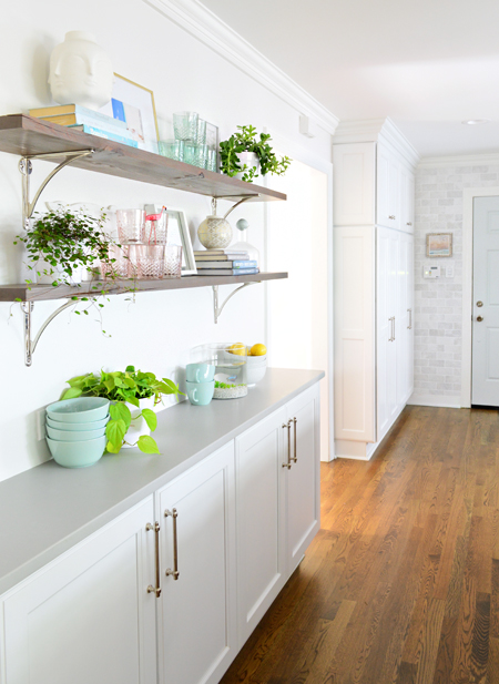
Our “Phase 1” improvements (like removing some upper cabinets, painting the trim and paneling, new lighting, hanging some open shelves, painting the upper cabs, staining the lowers, resurfacing the laminate counters with concrete, and getting new appliances when our dishwasher died on Christmas Eve two years ago) were a nice upgrade from where we started, but we were still sorely lacking in some functional areas.
When we look at the original floor plan, it’s what our friend (a kitchen designer) described as “a perfectly nice, single chef kitchen.” Since Sherry and I don’t usually cook at the same time, we initially contemplated just leaving the layout as it was and updating the cabinets and counters. But as time wore on and our family grew, so did our needs to use the kitchen simultaneously (to make school lunches and breakfast at the same time, to occasionally bake with our daughter, etc) and it became clear that things were unnecessarily cramped and we weren’t using the space as effectively as we could.
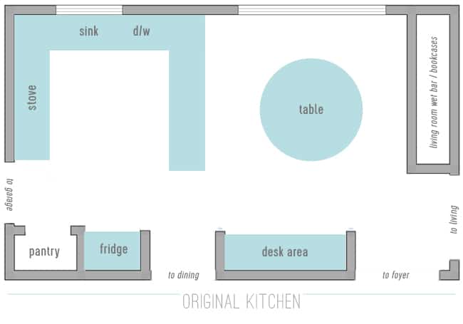
Our gripe with the layout wasn’t only about its size, it was also how closed off it felt. The person cooking felt blocked off from the table by the extra long peninsula – and walking back and forth from the stove/sink/prep area to the table during meal times felt annoyingly inefficient. I can’t begin to tell you how many times we made that trip while fielding sporadic kid requests for more OJ, food-cutting help, or the occasional hair pulling intervention.
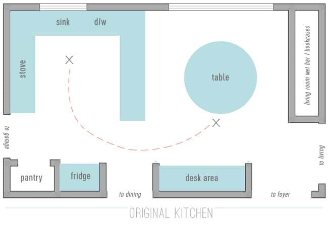
Even worse, the prep area felt MILES away from the living room (where the kids usually were during dinner making or breakfast cleanup). The wall there meant anyone working in the kitchen couldn’t see or barely hear what was going on in the living room. Whoever was in charge of dishes that night felt like they were in kitchen jail while everyone else watched TV and relaxed. So close, and yet so far. Clearly, that wall had to go.
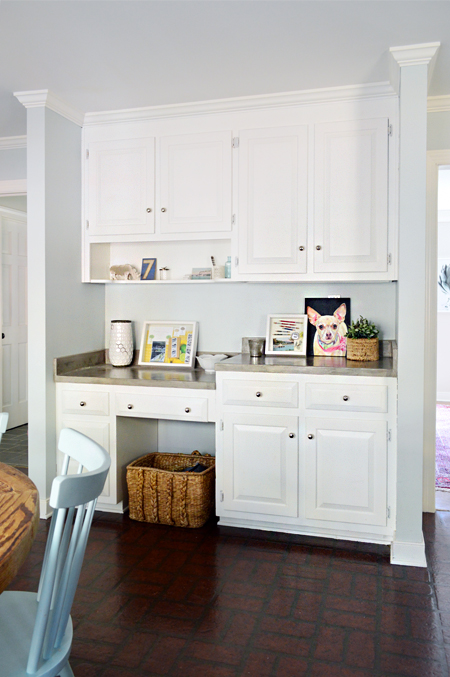
Another functional issue we were trying to solve was our lack of a drop-zone for shoes/coats/bags (oh how we longed for a mudroom). Since we always enter from the garage door that leads directly into our kitchen, for years our solution was to walk all the way through the kitchen and into the foyer to hang bags, backpacks, and coats in a foyer closet while tossing shoes into a basket under the desk area of the kitchen.
It semi-worked for a little bit but then it started to wear on us. Having all of our shoes thrown into one basket created a bit of a jumble, so the whole basket often got dumped when searing for some elusive other shoe, or we’d get lazy and leave our shoes out right next to the basket, just waiting to be tripped over. Bags and backpacks ended up on the counter or floor. Jackets were often left on the back of kitchen chairs. Plus, that stretch of floor between the shoe basket and the garage door was always SOOOO dirty from whatever we were tracking in on our shoes. We took turns sweeping it nearly every day.
When it came time to reconfigure this room once and for all, we wanted it to work a lot harder for our family. Having shoe, bag, and coat storage a lot closer to the door was a BIG MUST. So much so that at one point we entertained the idea of basically adding a wall to create a legit mudroom and shifting all of the kitchen function closer to the living room. It would’ve looked something like this:
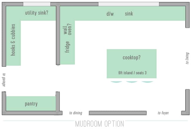
The idea of having that dedicated mudroom space was exciting, but there were some hurdles that kept making it seem impractical and cramped on the kitchen side. We didn’t love where some of the appliances would be forced to live in that situation, and while we’d be getting the island we wanted, it wouldn’t be large enough to seat all 4 of us. The kitchen would also be “losing” a window to the mudroom, and this room needs all the natural light it can get. So in the end, there were enough red flags to decide that it wasn’t the best option for us.
Fortunately, another solution that we picked up while shooting our second book was waiting in the wings: a hidden mudroom cabinet!
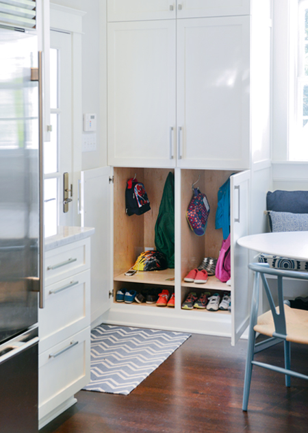
The photo above is from a family that faced a similar entry-into-kitchen issue and they solved it by building shoe and bag storage right into their cabinetry. When those floor to ceiling cabinets are closed, they blend into the rest of the kitchen cabinetry. But when the doors are flung open, they reveal a cubby for each person in the house (kid stuff on the bottom, parents on top).
When we decided to try implementing a hidden mudroom into our kitchen, it got us to a floor plan like this:
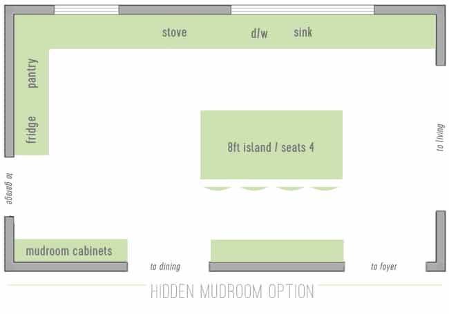
By building mudroom function into floor-to-ceiling cabinetry right next to the door, we’d solve our shoe problem – and we’d still have plenty of space for appliances and an island that would seat all 4 of us. We’d also get our open view to the living room, and we’d even be able to widen the doorway to the dining room so that felt more connected as well. But by expanding the kitchen to fill the entire room, a normal 8ft-long island looked totally dwarfed.
The obvious answer (just make the island bigger!) wasn’t necessarily easy. Most stone materials come in 8 foot slabs, so anything larger would require a seam. We actually encountered this issue in our showhouse, which had an 11-foot island. We made the seam work okay in there, but always wished we’d been able to dodge having one.
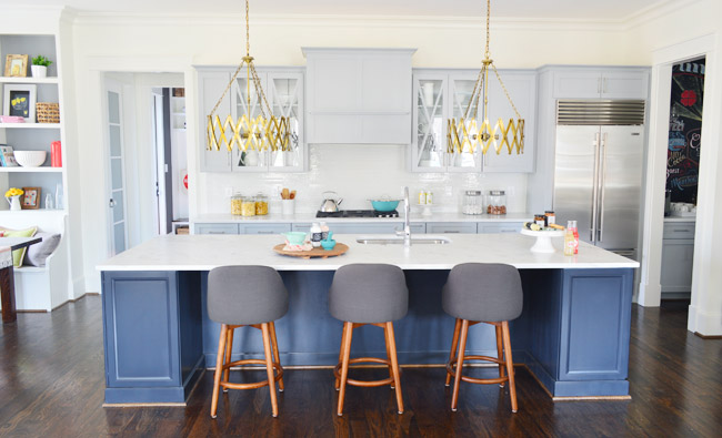
Our solution came in the form of Cambria Quartz, which is the material we were hoping to use anyway because of how durable and low maintenance it is. We’ll talk more about it later when we share all of our material selections, but the pertinent layout fact is that they now sell 11-foot “super slabs,” which meant we could stretch the island to better fit the space, avoid having a seam, and easily accommodate 4 stools (one for each of us). Plus – like the showhouse island above – we could add some bonus base cabinets for storage on each end. Win, win, win. Enter our ten foot island, stage left.
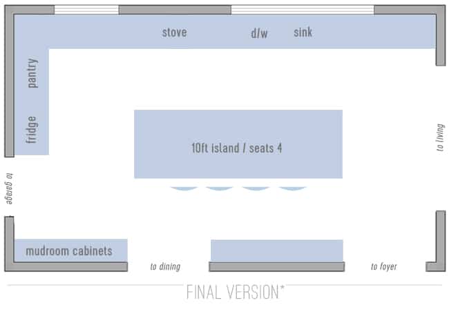
So that’s basically where we ended up, apart from one 11th hour switch that we’ll get into later when we talk about mistakes (oh the mistakes!). You may be having the same reaction we first had: wow, that’s a big kitchen. Especially compared to the footprint that we started with. And having come out the other side we can say this: yes, it is big. But it has turned out to be a much better use of the space for us, and we’re so glad we took the time to work out the best option that checked all of the right boxes for us, like:
- significantly increasing storage and prep space (there’s a lot more of both)
- moving the main prep/sink area much closer to the eaters
- making the kitchen and living room A LOT more connected
- gaining dedicated shoe/bag/coat/backpack storage right next to the entry door
- adding an island for eating/homework/hanging out with seating for all four of us
We did worry that the work triangle (the distance between the sink, fridge, and stove) would feel too spread out, but it hasn’t bothered us at all. In fact, we’ve been able to group and store things in a way that has made our mealtime routines much more efficient. But more on that in another post. For now, we’ll leave you with two more finished shots. Here’s that “hidden mudroom” we created next to the door, which has been a total game changer for our sanity.
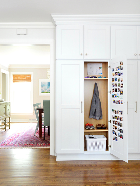
They’re just two identical, side-by-side floor-to-ceiling cabinets (each with two doors). The kids share the cabinet that’s closest to the dining room (they each get a side), and Sherry and I share the other. It’s almost like each door creates our own “locker,” complete with a personal basket for shoes, hooks for coats/bags, and a shelf up top for sunglasses, hairbrushes, keys, etc. We even added a few outlets so we can charge our devices in there. Plus we can each use the backs of our own cabinet’s door for photos, calendars, and magnet boards with reminders. In a word, it has been AWESOME.
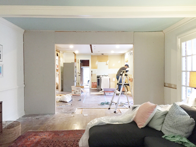
Next up we’re gonna take you through the whole demo and reconstruction process, so get ready for some pretty gnarly photos of this room getting stripped down to nearly nothing, and built back up in a completely new way. I’m sure you have a million questions about that and everything else (again, we have a ton of info and photos to share), so hang tight and we’ll do our best to get that together for you in the next week or so. In the meantime you can find me not walking around a peninsula 68 times per morning. Hallelujah.
P.S. – If you’re wondering what wall colors we used in any room, or where we got something (a rug, lighting, furnishings, etc) we created this page for you with all of that info.
The post Kitchen Remodel Chapter #1: A Totally New Layout appeared first on Young House Love.
No comments:
Post a Comment